
I found an article today about a new domain extension thing (they’re called top-level domain). On the sidebar of the article was a cool image called The Internet Map. Isn’t it beautiful?

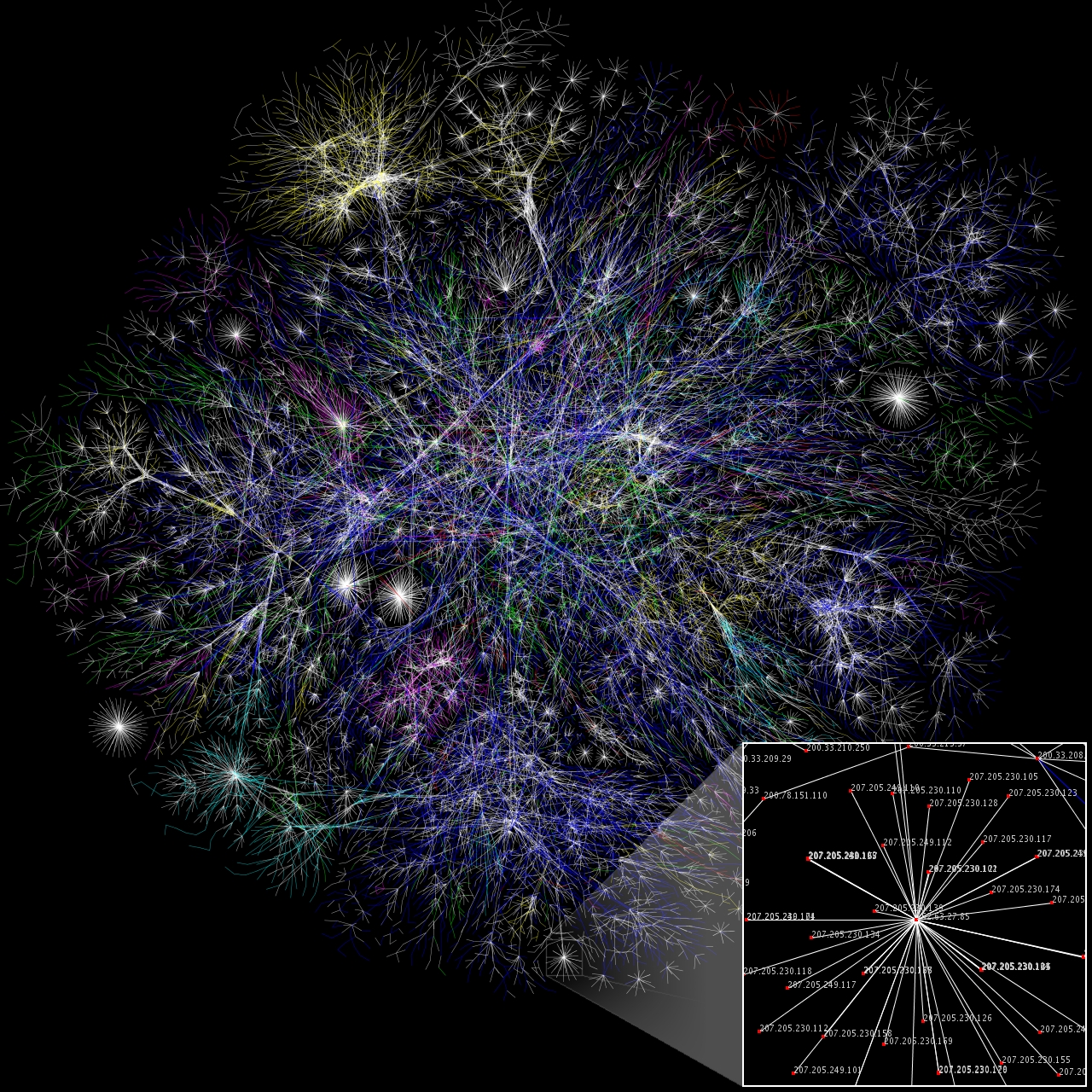
attributed to Matt Britt
larger, more detailed version
The description says:
Partial map of the Internet based on the January 15, 2005 data found on opte.org. Each line is drawn between two nodes, representing two IP addresses. The length of the lines are indicative of the delay between those two nodes. This graph represents less than 30% of the Class C networks reachable by the data collection program in early 2005. Lines are color-coded according to their corresponding RFC 1918 allocation as follows:
* Dark blue: net, ca, us
* Green: com, org
* Red: mil, gov, edu
* Yellow: jp, cn, tw, au, de
* Magenta: uk, it, pl, fr
* Gold: br, kr, nl
* White: unknown
That’s so gorgeous. Thanks very much for linking to it.